

How To Create A Logo From Scratch In Illustrator
Create a geometric logo with Illustrator
Adobe Illustrator has grown massively in recent years to become the number one vector tool worldwide. It's the programme that, when it launched way back in 1987, revolutionised the desktop publishing industry, giving graphic designers and artists the power to create almost anything they can think of.
Hone your Illustrator skills with these brilliant tutorials
In this tutorial we are going to create a custom type logo design, based on perfect geometry, just using this vector software superstar.
Branding is one of the most interesting areas of visual design, and even the smallest businesses now understand the importance and the value of having a custom logotype. With Illustrator CC, lettering artists and designers can create great pieces of art from scratch, in a relatively short time.
The example we are about to produce here involves a similar approach to creating your own font. However, in this case the process is simpler because we're using fewer characters. We are actually making the first steps in designing a custom typeface, which could be further developed and eventually used in InDesign for our branding material.
It's important to bear in mind that not every logo needs a symbol or an icon associated with it. There are plenty of companies around the world that have a wordmark that embraces the values of their business. If you choose to go down this route, remember that the wordmark has to look professional and clean. That's exactly what we will be doing in this tutorial: taking care of the form, the typography and the geometry of the logo.
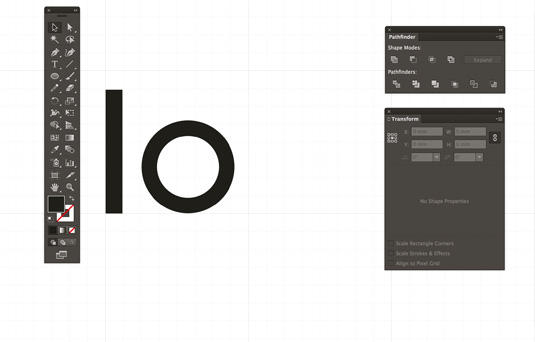
01. Launch Illustrator
Launch Illustrator CC and turn on the grid (cmd+'). It may sound obvious, but when you are designing a logo, having the grey grid visible is really helpful. The brand name we've chosen for this exercise is 'Eleonora'.
The word has personality and a nice balance of curvy shapes, which will make the tutorial interesting. Eleonora is a startup specialising in translation, but you can adapt this approach to any business type, as the process of creating shapes and letters stays the same.
02. Craft the letters
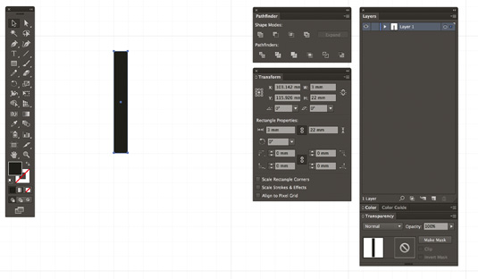
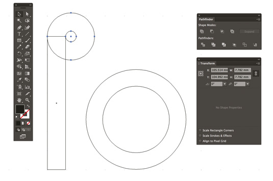
Let's start with the two simplest shapes: the 'l' and the 'o'. From these two shapes, we can create the whole logotype. At first, we are just focusing on crafting the letters, and not taking too much care with the spacing. You can be imprecise at this stage – precision will come later. Zoom the artboard to 400% and draw a rectangle of 22mmx3mm.
03. Align points correctly
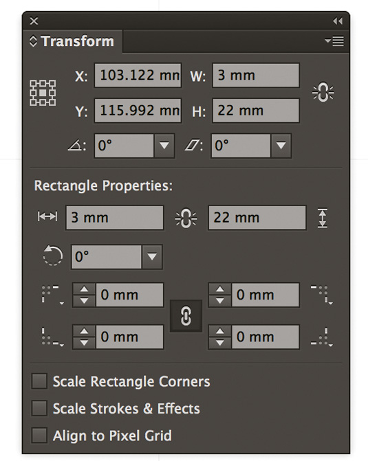
One thing to bear in mind is to make sure you uncheck the Align to Pixel grid tick box in the Transform panel. This can save you some headaches, as you'll have more freedom to move around the shapes you are creating and align points correctly.
04. Drawing circles
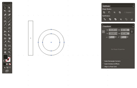
Draw a circle of 16.5mm x16.5mm. Then, draw a smaller one (11mm x11mm) on top of the previous one, using the same centre point. A simple way to do this is to copy and Paste in Place (Shift+cmd+V) the bigger circle (cmd+F) and then reduce its size.
Alternatively, create a new circle from scratch using the same centre point. Press cmd+Y to switch to the outline view.
If you often work with Illustrator, you'll know the Pathfinder tool is your best friend. Select both circles, then go to the Pathfinder panel and, under Shape Modes, select Minus Front. This will subtract the top shape, giving you a perfect letter 'o'.
06. Creating curves
Let's move onto some other letters. We can now create the bottom curve for the letter 'l' – this will be useful later, when we come to create the 'r' and part of the first 'E'. Switch again to the outline view (cmd+Y) and create a doughnut shape at the top of the 'l'. We just need a quarter of this to create the bottom of the 'l'.
07. Zoom
Zoom your artboard at 800%. To cut out a quarter of the doughnut shape, use the Pathfinder tool as described in the previous step.
08. Create a seamless shape
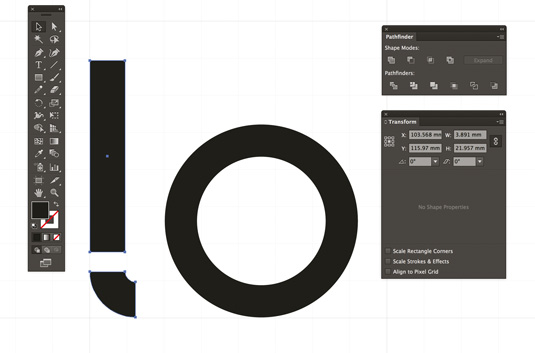
Position this quarter at the bottom of the letter 'l'. At this stage you can connect the square part of the letter with the curvy one to create a seamless shape.
Select the bottom two anchor points of the square part with the Direct Selection tool (A) and drag them down until the square part connects with the curvy part. Create a compound shape using Pathfinder.
09. Positioning
Now we can start to position some of the letters. We will have time to refine this process, but this will act as a good guide for now. At this stage we have not chosen any colours, and we are using black for practicality. With our grid turned on (cmd+'), we can ensure all the letters are perfectly aligned at the bottom.
10. Outline view
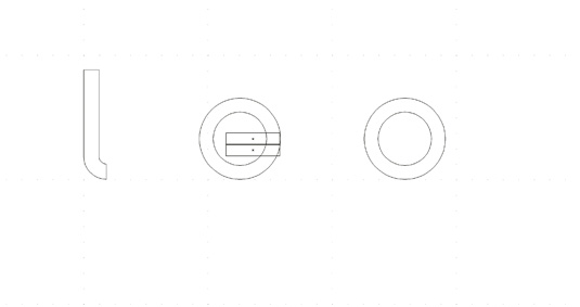
Starting from the letter 'o' we are now going to create the letters 'e' and 'a'. This process is pretty simple and our main tool is – once again – the Pathfinder tool. You'll need to use the outline view for this step. Draw two rectangles of 11mmx2.4mm on top of the letter 'o'.
Next page: more steps to create a geometric logo...
Current page: Page 1
Next Page Page 2
Related articles
How To Create A Logo From Scratch In Illustrator
Source: https://www.creativebloq.com/illustrator/create-geometric-logo-illustrator-61515066
Posted by: fleckthervin.blogspot.com
0 Response to "How To Create A Logo From Scratch In Illustrator"
Post a Comment